Foundation Dental Intelligence
Blog No. 79
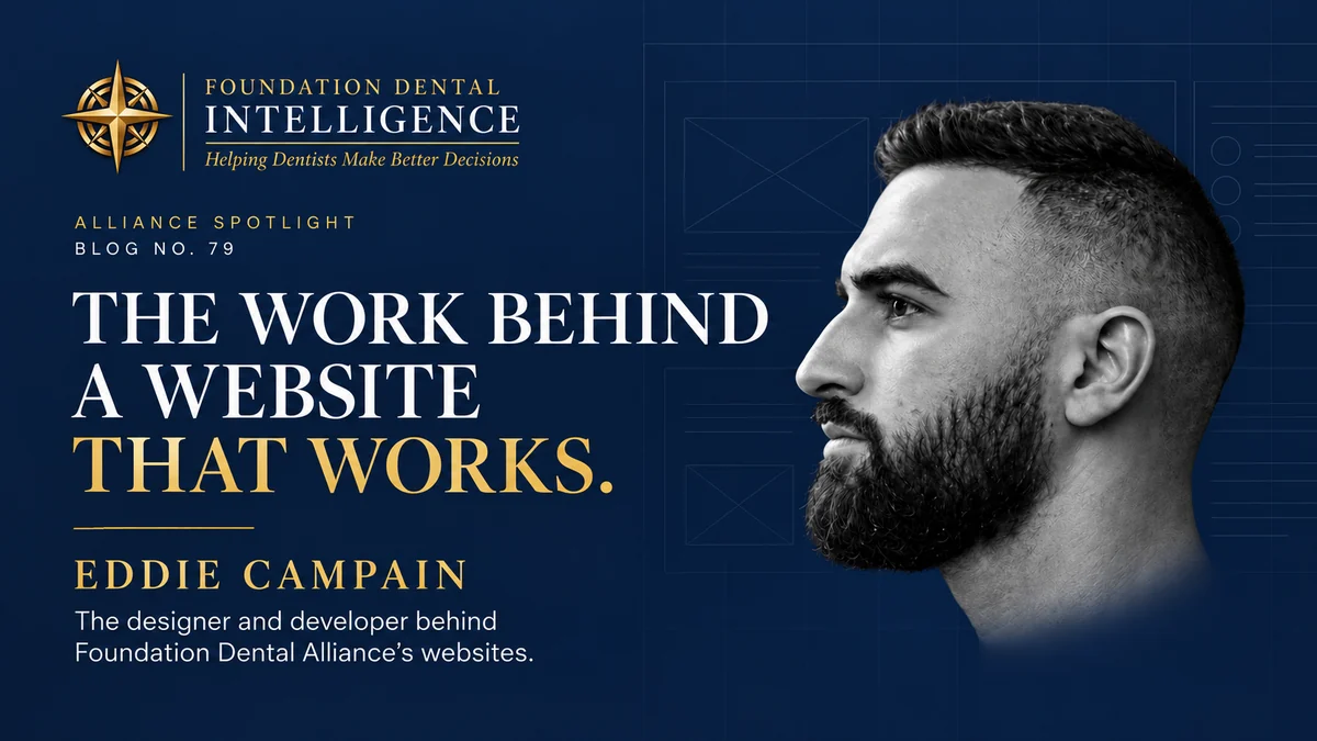
Eddie Campain and the Work Behind a Website That Works.
The designer and developer behind the Foundation Dental Alliance sites, and what dentists should look for when hiring one.
ALLIANCE SPOTLIGHT
Eddie Campain
Founder, Average Genius Company | Website and Product Design | Director of Product, Clearways.ai
Your website can make an excellent practice look ordinary.
The clinical judgment you’ve spent decades sharpening, the team you built one hire at a time, the way your assistant talks to somebody who’s terrified of being in that chair. None of that makes it onto a screen by itself. A prospective patient only sees what the site gives them, and a few attractive photographs over interchangeable language won’t explain why they should choose you over the other four offices on that road. Plenty of practices end up buying a website the way they buy a piece of equipment, and the site goes live without anything changing at the front desk on Monday morning.
When I started building out the Foundation Dental Alliance ecosystem, six businesses with six different jobs to do, I sent Eddie Campain a detailed build package and found out quickly that I was working with somebody different. What he did with it is the reason this article exists.
A finished website shows you appearance. It doesn’t show you the thinking that produced it. The decisions that actually determine whether a site works happen earlier, in what the business needs it to accomplish, and later, in the details nobody reviews in a design presentation. Eddie Campain is unusually good at both ends of that, and his work across the Alliance is the easiest place to see it.
Six Businesses, One Identity, Six Different Decisions
The Alliance gave him a problem a single homepage couldn’t solve. Foundation Dental Intelligence publishes the newsletter, blog, and podcast. Foundation Dental Mastermind takes applications. Luxury Dental Retreats has to carry both the professional value and the destination. Foundation Dental Transitions speaks to dentists facing decisions that shape the rest of their careers.
A visitor weighing a retreat needs different information than someone evaluating transition representation. A podcast listener may just want the next conversation. All of those sites have to respect the difference without making the Alliance look like a collection of unrelated companies.
Look at how he handled it. The compass, the navy, the gold, and the typography carry the connection across every property. Then the content shifts to the decision in front of that particular visitor. The Transitions page opens on protecting the value of what a dentist has built. The Mastermind page opens on building a practice worth owning and eventually worth selling. The Retreats page puts the destination alongside the difference between information and perspective. Same family, six different first sentences, because the question in the visitor’s head is different on each one.
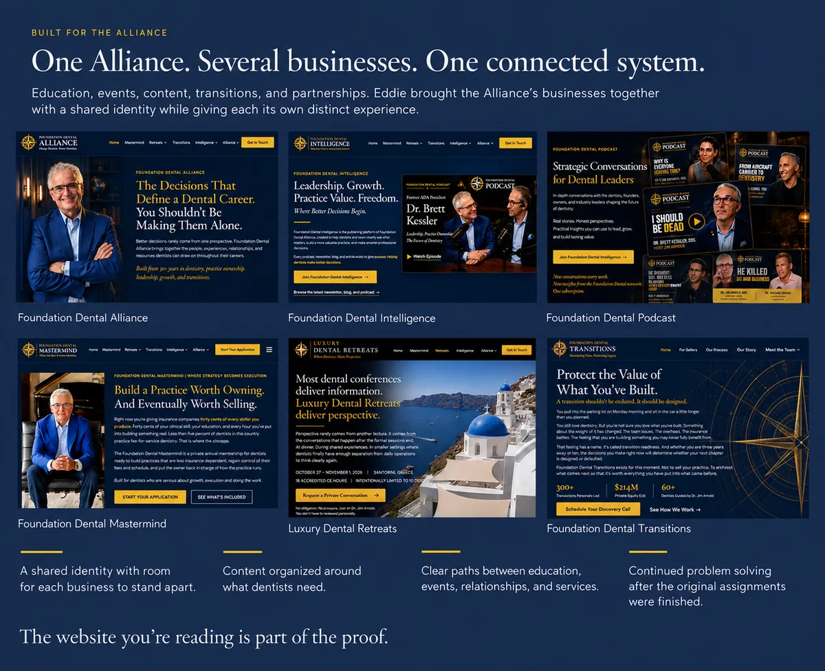
Six Foundation properties, one visual system. The shared identity is the straightforward part. Giving each business its own opening argument is where the judgment shows.
Those ideas came out of the direction I gave him. His contribution was understanding that direction well enough to make it work across six sites and then improve the execution without losing what I cared about.
“From the very first build package I sent him, it was obvious he was different. I gave him a detailed vision with layouts, typography, screenshots, and design direction. He came back with something that looked almost exactly like what I had in my head. In many cases, he made it even better.”
No dentist should have to choose between a website that reflects their vision and a designer who contributes something of his own.
A Stalled Practice Website, Finished in a Month
Some of the most useful evidence comes from another kind of healthcare practice. Northshore Redi-Med is a psychiatric and primary care practice in Mandeville, Louisiana. Four board-certified clinicians provide psychiatric evaluations, medication management, and advanced treatments like TMS, and the same location runs walk-in urgent care, primary care, and occupational health.
When the practice brought Eddie in, its new website had already been sitting with another agency for months. Promised updates hadn’t arrived, deadlines kept sliding, and the most visible thing the practice owned sat half finished while patients searched for somebody else. He designed and built a new twenty-two page site and had it live in under a month: ten service pages covering the full clinical menu, profiles for all four clinicians, and a contact page with a HIPAA-aware inquiry form and a map, all laid out for the phone first, because that’s where so many patients start looking.
The decision I’d point a dentist to is what happens after launch. Eddie set the practice up with a content management system its own team runs, and he locked it down on purpose. Staff can change the phone number, hours, address, the accepted-insurance list, the homepage banner, each provider’s photo and bio, and the headline on every service page. Site structure, navigation, layout, and legal disclaimers stay out of reach, so nobody breaks the site on a busy afternoon. When someone hits publish, the site rebuilds and the change is live in about ninety seconds.
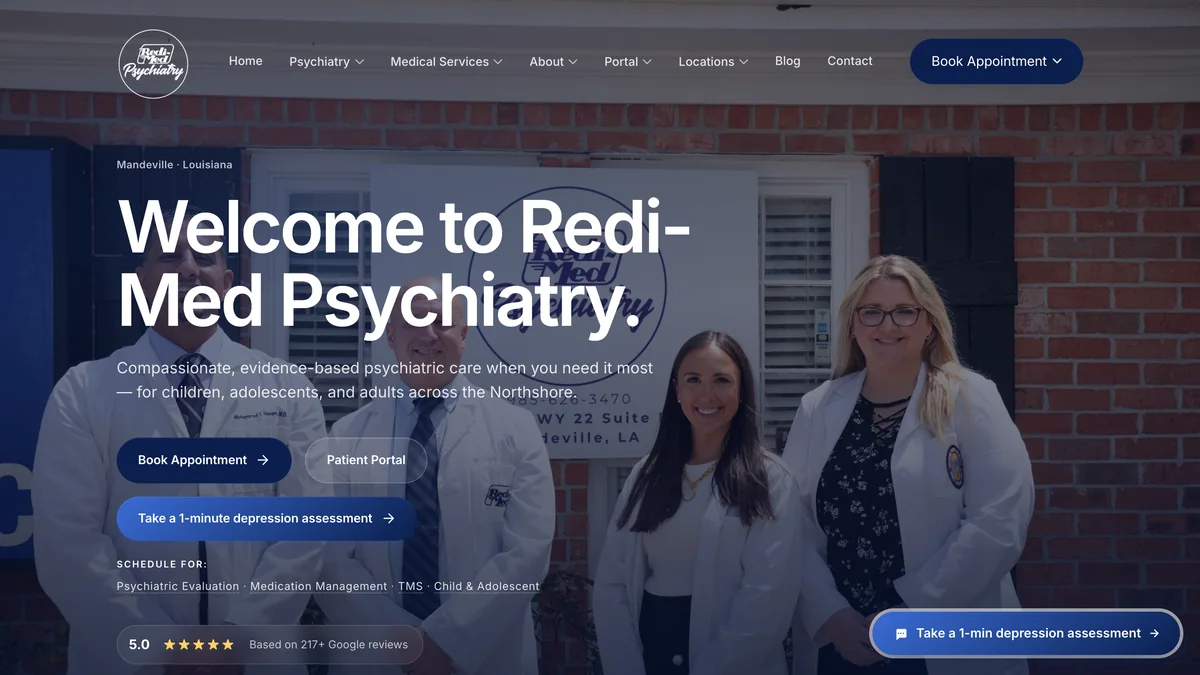
Northshore Redi-Med’s home page. Booking, the patient portal, and a one-minute depression assessment sit where patients look first, and the practice’s own team keeps the details current.
A dental website should answer the questions patients need resolved before they’re comfortable enough to call.
Translate that to a practice. The insurance list is the question your front desk answers on every new patient call. The hours are what a patient checks the week of a holiday. A new associate’s profile is how a nervous patient decides whether to book with her. If every one of those changes waits on a developer, the site drifts out of date within a season. His own partner page puts it well: he handles the details most clients never know to request.
The work didn’t stop at launch, either. Since the site went live he’s added a depression screening prompt that follows patients through the site on a phone and a video gallery of real patient stories for the TMS program, and new requests typically turn around the same day. His Northshore Redi-Med case study walks through the full build.
When the Simpler Design Wins
His work at Marsh, the global insurance broker, shows what happens when a visually interesting idea competes with the task a person is actually trying to finish. He spent three years there as a UX developer, designing and building the tools senior brokers, placement specialists, and catastrophe-modeling leads use to make high-value property insurance decisions under deadline.
His published case study on the risk optimization project reads like a series of moments where the evidence won. A drag-and-drop interaction lost to a plain table with binary switches, because brokers needed to move through 37 peril states quickly and one-glance clarity mattered more than the interaction. Long stacks of separate cards gave way to a single grid, because comparison was the actual job. Horizontal tabs became a vertical sidebar after three of four test users closed the configuration drawer before they were finished. A one-shot calculator turned into a workspace with auto-save and a visible draft action, because feedback exposed a requirement nobody had written down. The tool went through a controlled beta with brokers before it reached the firm’s wider network.
Clarity beats novelty every time the clever version makes the work slower.
Anyone who can make an interface visually interesting also has to recognize when that interest is getting in the way, and be willing to give up his own idea. On a dental site the equivalent might be simplifying a menu, moving appointment information somewhere obvious, or taking a field out of an inquiry form. The right answer depends on the task and the evidence, not on taste.
On a separate Marsh initiative called Values Collection, his case study describes replacing a white-labeled workflow the firm had been licensing from an outside vendor. A working proof of concept came together in about two weeks, with a pre-filtering step built in early so the page wouldn’t buckle under a full location table. When the same person designs the interface and builds it, performance and usability get treated as one problem rather than two departments arguing about whose fault it was.
The Work Nobody Was Grading
The clearest look at how he thinks is a project nobody hired him to build. Savant is a design system Eddie publishes through his practice, Average Genius Company, and anyone can use it for free. A design system is the rulebook underneath a website or an app. Every color, type size, spacing value, button, form field, and layout pattern gets defined once and reused everywhere, so each new page starts from settled decisions instead of re-deciding them.
Savant covers 61 components and patterns built on 115 design tokens, with matched light and dark themes held to WCAG 2.1 AA contrast throughout. The tokens work in three tiers: raw values like a specific shade of purple, roles like primary text or a raised surface, and values that belong to a single component. No component reaches for a raw value directly, so one change flows everywhere and the light and dark versions can’t drift apart. To prove the foundations hold, it ships with working starter screens for a finance dashboard, a video service, an AI assistant, an email client, a project board, and a social feed, each built only from Savant’s own parts.
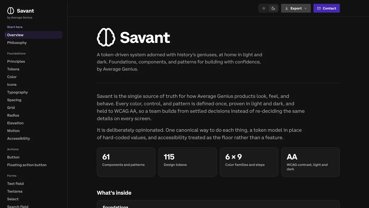
Savant, the free design system he publishes through Average Genius Company. Every color, control, and pattern is defined once and held to WCAG AA contrast in light and dark.
It’s deliberately opinionated: one right way to do each thing, and accessibility treated as the floor rather than a feature. It also exports itself, as a stylesheet a web team can drop into almost any framework and as a brief written for AI coding tools, both assembled from the live system so they can’t fall out of date. One line from the philosophy he publishes alongside it has stayed with me. “If it feels wrong, it is wrong. You are the most forgiving user your product will ever have.”
A website that grows without a system slowly turns into several websites.
That matters to a dentist more than it sounds. A practice site doesn’t stay the size it launched at. You add a service, an associate, a membership plan, a second location. Without a system, each addition gets built a little differently, and within a couple of years the site reads like four different people made it. With one, the new page inherits the same type, color, controls, and readable contrast as everything around it. A psychiatric practice, a team of insurance brokers, and the designers and developers who build on Savant are completely different audiences. He’s had to learn the problem every time.
Where Website Projects Usually Lose Their Meaning
Nobody sets out to deliver a diluted website. It happens in the gaps between people. The person who sat in the discovery call isn’t the person who writes the strategy. The strategist hands a deck to a designer. The designer hands a file to a developer. Nobody makes a mistake and the finished thing still arrives with the original point sanded off. His own published model for avoiding that is worth putting next to how it usually goes.
| Stage | Where it commonly breaks | How Campain works |
|---|---|---|
| Discovery | The nuance gets compressed into a summary somebody else reads later. | The person shaping the product sits in the discovery himself. |
| Strategy | Features get scoped before anybody knows what’s feasible or what it costs. | Goal, exclusions, constraints, and measures get settled early. |
| Design | The interface gets polished inside a design file instead of tested in the real system. | Decisions get tested with users and engineering while they’re still reversible. |
| Build | Developers interpret intent after the decisions have gone cold. | He stays close enough to implementation that the finished site still means what the brief meant. |
For a dentist the practical version is simple. You want one person carrying the decisions from the first conversation through launch, because that’s how what you described in January is still recognizable in April.
What a Portfolio Can’t Tell You
There’s a part of hiring that screenshots will never settle. You can judge how a finished site looks. You can’t see how many times the client had to repeat a request, how revisions were handled, or whether the relationship made the project harder than it needed to be. That’s the part I can speak to directly.
“What impressed me most was how he worked. He’s incredibly creative, remarkably responsive, fast, accurate, and genuinely collaborative. He listens. He asks thoughtful questions. He welcomes feedback, implements changes quickly, and often anticipates what I’m looking for before I even ask.”
Dr. Jim Arnold
Every one of those is something a dentist can evaluate before signing anything. Accuracy means a change lands the way you asked for it. Responsiveness means the project moves when a decision is ready instead of waiting a week. Thoughtful questions keep a misunderstanding from turning into three more rounds. And while a practice is in the middle of a website build, every unresolved detail is attention you owe to patients instead. What I wrote about working with him covers the rest of it.
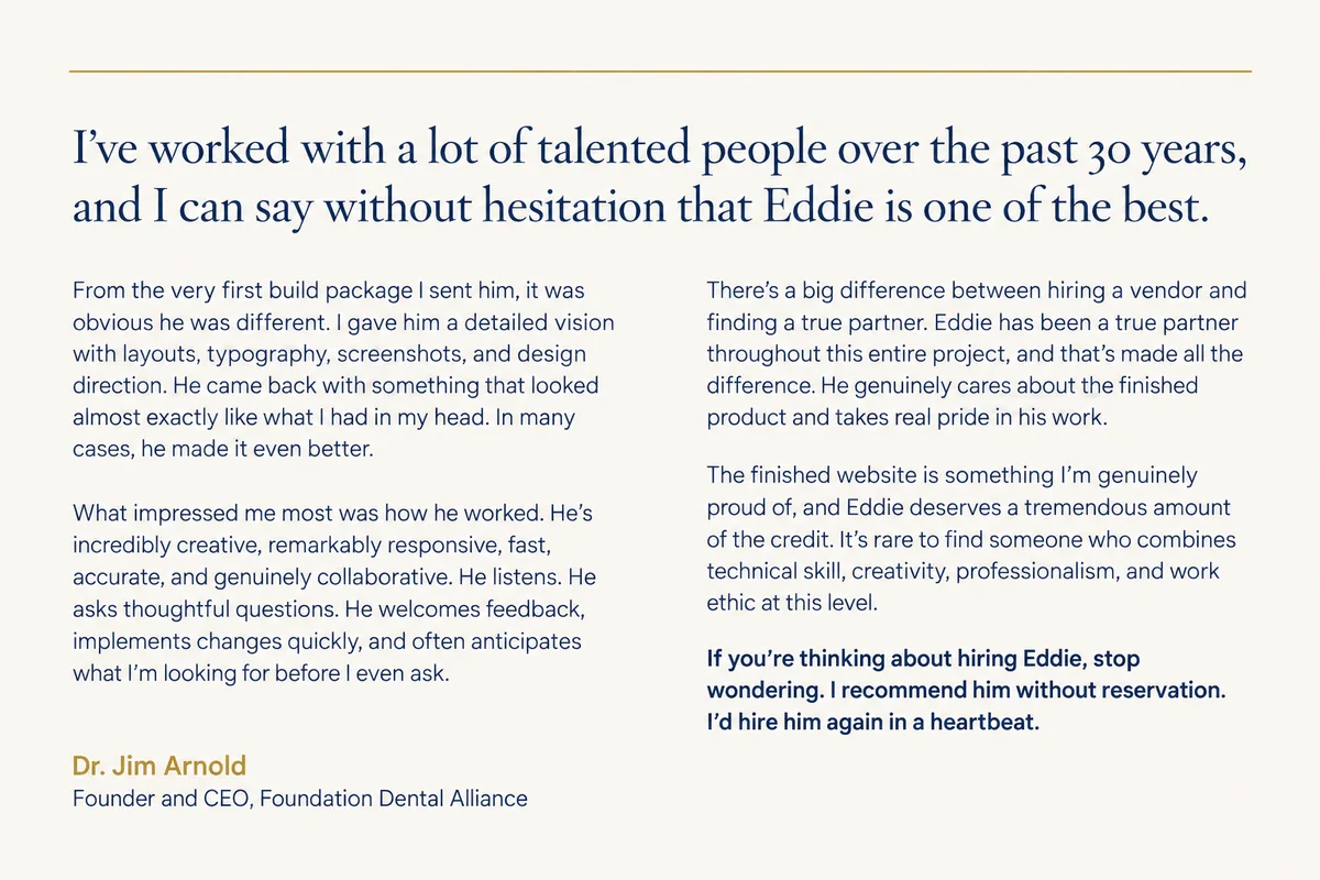
The full recommendation, published on his Foundation Dental Alliance partner page.
What to Ask Before You Hire Anyone to Build Your Site
Ask to see a finished project, then ask why it works the way it does. Which decision changed after feedback? What got simplified, and what did the designer give up to simplify it? How did the business’s priorities shape the structure? What happens when you add a service, a clinician, or a second location? Who on your team will be able to update the hours and the insurance list once it launches? A useful answer goes past taste and connects the design to the people using it and the work the business needs done.
On your side of the conversation, be ready to explain the questions your team answers over and over, the patients you’re actually trying to reach, and the parts of your practice that don’t come across online today. Then get clear on who carries those priorities through design, development, revisions, and launch.
The person building your website should be able to explain how the design serves the business before asking you to approve how it looks.
Agree on measurement while you’re at it. We covered that ground in Blog #78 with Neil Zemba of Rise DDS on the connection between marketing activity and practice results. Before a build starts, decide what a useful inquiry looks like and how you’ll know whether those inquiries turned into appointments.
A Recommendation Earned Through the Work
A lot of what the Alliance looks like today belongs to Eddie. I brought him a vision and he built it, then found the places where it could be better and built those too. He’s carried that standard across six businesses, through every round of changes, and into the parts of the work nobody was ever going to review. I’m grateful for it, and this article is the clearest way I know to say so.
“If you’re thinking about hiring Eddie, stop wondering. I recommend him without reservation. I’d hire him again in a heartbeat.”
Dr. Jim Arnold
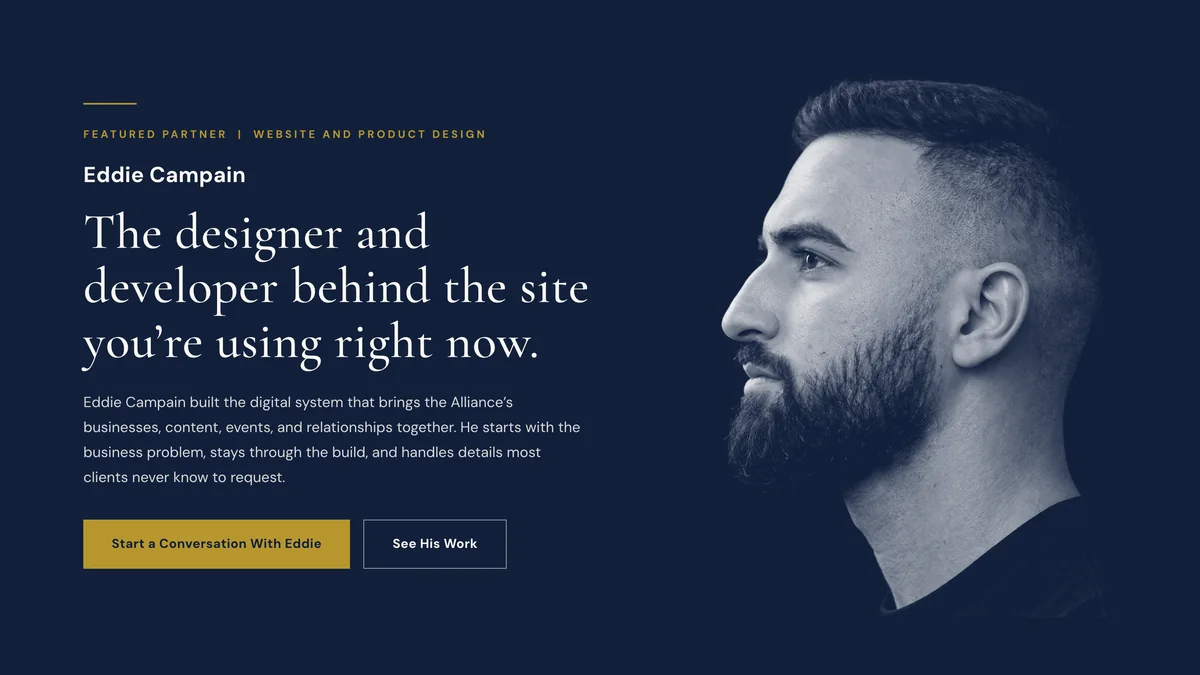
His partner page at FoundationDentalAlliance.com/network/eddie-campain, which he also built.
If your website doesn’t reflect the practice you’ve built, his full partner profile is at FoundationDentalAlliance.com/network/eddie-campain, Savant is open to anyone at savant.averagegeniuscompany.com, and a conversation starts at AverageGeniusCompany.com.
Questions Dentists Ask About Hiring a Website Designer
What should a dental practice website do besides look good?
It should answer the questions patients need resolved before they’re comfortable calling, explain what makes the practice different in language patients recognize, make booking and contact obvious, stay current as hours, providers, and insurance plans change, and remain usable for everyone, including patients using a screen reader.
What should a dentist look for when hiring a website designer?
Look for someone who can explain how the site will serve patients and support the practice’s goals, not just how it will look. Review finished work, ask which decisions changed after user feedback, and get clear on who carries responsibility through development, revisions, and future updates.
Can a practice update its own website without calling a developer?
It can if the site is built for it. A content management system with a locked-down admin lets the team change hours, insurance lists, provider bios, and service details while the layout and code stay protected. On the Northshore Redi-Med site Eddie built, a published change is live in about ninety seconds.
Does accessibility and metadata work really matter for a dental website?
Yes. Readable color contrast, descriptive alternative text, clear page titles for each service and location, and accurate social card data affect whether patients find you, whether they can use the site, and whether a shared link looks credible enough to click.
Who is Eddie Campain?
Eddie Campain is the designer and developer behind the Foundation Dental Alliance websites. He’s the founder of Average Genius Company, where he publishes the free Savant design system, and he’s currently Director of Product at Clearways.ai. Earlier, he spent three years as a UX developer at Marsh.
Does he handle both website design and development?
Yes. His Alliance work covers both, and so did the Northshore Redi-Med site, content management system included. Average Genius Company describes a process that runs from research and strategy through design, development, launch, and iteration afterward.
Which Foundation Dental Alliance websites did he build?
He built the connected system behind Foundation Dental Alliance, Foundation Dental Intelligence, Foundation Dental Mastermind, Foundation Dental Transitions, Luxury Dental Retreats, and the Foundation Dental Podcast, with a shared visual identity and a distinct experience for each business.
About the Author
Dr. Jim Arnold is the Founder and CEO of Foundation Dental Alliance, an interconnected platform serving dentists from dental school through retirement. He has 30 years of experience as a multi-practice owner, has been involved in more than 60 dental practice transitions, was a DSO executive, and achieved 31% EBITDA in a private practice group. He leads the Foundation Dental Mastermind, Luxury Dental Retreats, co-founded Foundation Dental Transitions, and hosts the Foundation Dental Podcast. He also publishes the Foundation Dental Newsletter and Blog weekly, focused on leadership, practice design, and long-term sustainability in dentistry.
Stay Connected
Websites
FoundationDentalAlliance.com
FoundationDentalMastermind.com
FoundationDentalTransitions.com
FoundationDentalNetwork.com
LuxuryDentalRetreats.com
Social Media
LinkedIn: linkedin.com/in/arnoldjim
Instagram: instagram.com/smilesbyarnold
YouTube: youtube.com/@DrJimArnold
Facebook: facebook.com/smilesbyarnold
Twitter/X: twitter.com/smilesbyarnold
TikTok: tiktok.com/@foundationdentalalliance
Google Business Profile: tinyurl.com/2t3chcv6
Publications
Foundation Dental Newsletter: FoundationDentalNewsletter.com
Foundation Dental Blog: FoundationDentalBlog.com
Foundation Dental Podcast: FoundationDentalPodcast.com
Contact
Professional Email: drarnold@foundationdentalalliance.com
Foundation Dental Intelligence | No. 79 | September 15, 2026 | © 2026 Foundation Dental Alliance